Dreamflows is the go-to source for west coast river flows, but sometimes you want to see data that goes further back. Recently, with the help of ChatGTP, I compiled over 30 years worth of data and plugged it into a chart allowing you to select Upper or Lower Kern and the year. Important to note that the Upper Kern data is not from the gauge in Kernville, this is the Below Fairview Dam river gauge. This is why the recent flood shows the river peaking at 25k CFS and not the 45k, for example.
It looks like you’re on a mobile device – please turn your phone sideways so you can see the graph. The graph has more features on desktop btw 🙂
Southern Sierra Snowpack
The Southern Sierra snowpack from April 1 is listed below as well. Or view them here
2023:
2022: 42%
2021: 43%
2020: 45%
2019: 154%
2018: 51%
2017: 163%
2016: 73%
2015: 5%
2014: 31%
2013: 34%
2012: 37%
2011: 161%
2010: 105%
2009: 78%
2008: 98%
2007: 37%
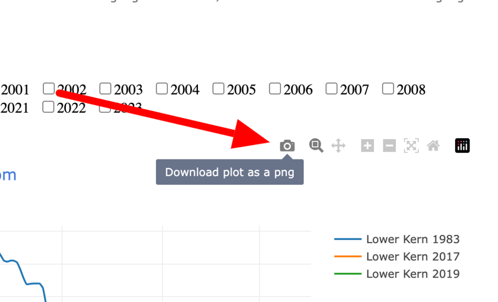
Saving the graph
To save a graph selection as a photo, hover over the graph and then click the camera icon in the top right. This will save it as a png to your computer.
Zooming in on the graph
Zooming is helpful if there is a river flow spike or drop that skews the line making it harder to see the other years. Zooming in, allowing you to cut out these spikes or drops is easy. Simply click and drag to select the portions of the graph you want and it will automatically resize to only highlight that segment.
Thanks for reading! Similar topics:
- All Kern River articles
- Popular: Where does the Kern River start?
- Popular: Kern River Hot Springs
- Popular: Best Kern River rafting campgrounds